

Make it stand out
Heyobi App Scaling

The problem
Too many commponents fightignfor the user attention, these component are
status case which tends to be diffcutl bcuse it is burrrie
The goal
“Make finding a wedding venue easy and fun-filled experience.”
Introduce your brand
For each insight I referenced an analytics pattern and a user quote. These insights directly motivated the concept I prioritized: a redesigned homepage hierarchy plus a unified status card component.
Improve feature discoverability and average feature engagement.
Create a single, consistent status presentation for ongoing processes.
Reduce notification noise by surfacing status in-app.
deeeer problem
most of these Components are just enrey point that look like teasers of DIY which is makes it harder anot actuall entry point and they do not show status
After an initial analysis I framed the problem: discoverability was low, the page was cluttered, and status communication was inconsistent.
Inconsistent and scattered status communication across flows.
journey mapping: mapped the fifferent user jounies for featuers and the personas for thesis featuer. goal to find where the user is suffereing.
Cross-functional affinity mapping sessions
Impact vs. Effort
Voting exercise to shortlist concepts
Ideation
IA
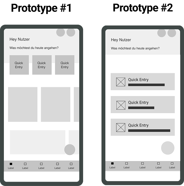
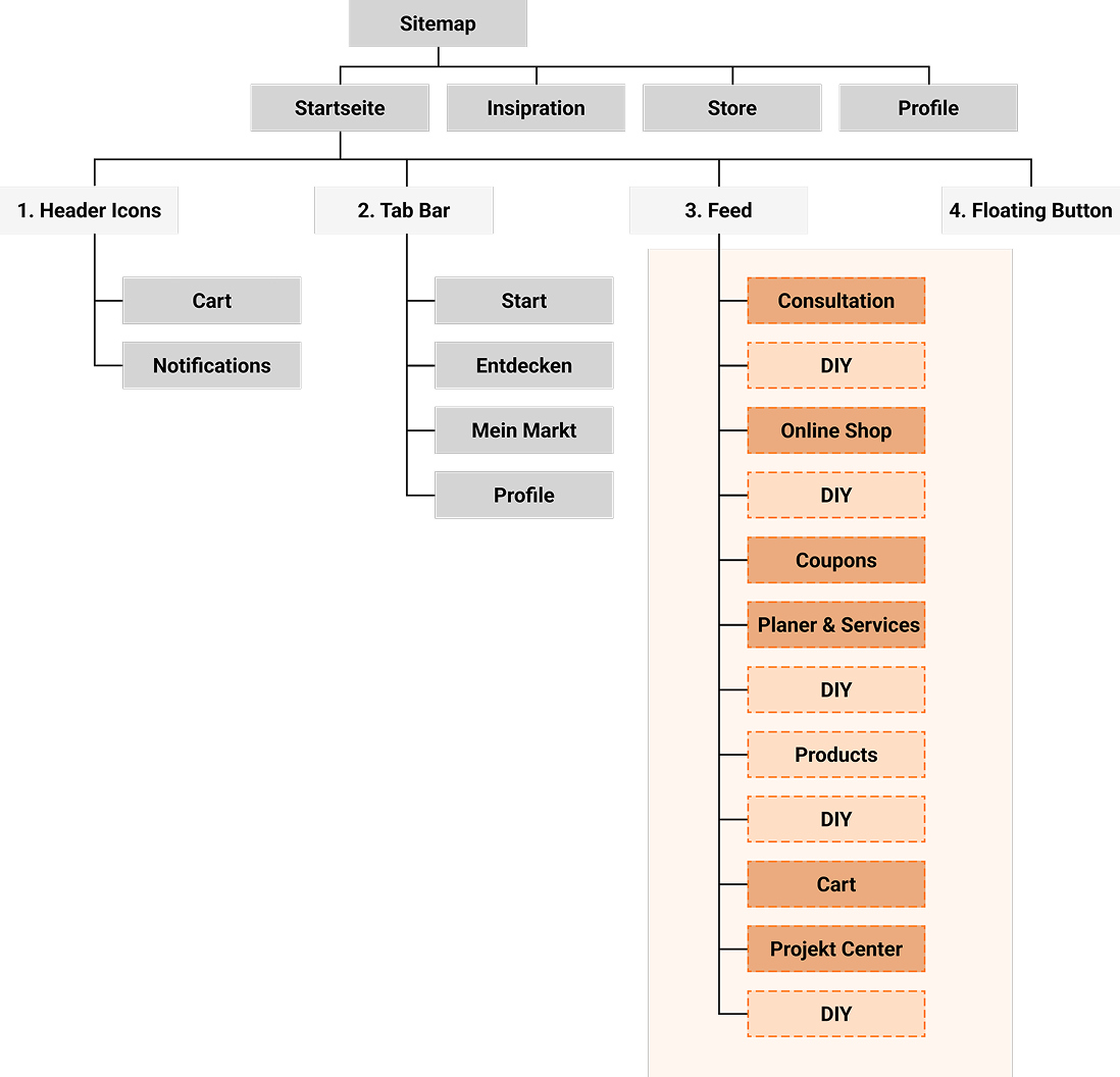
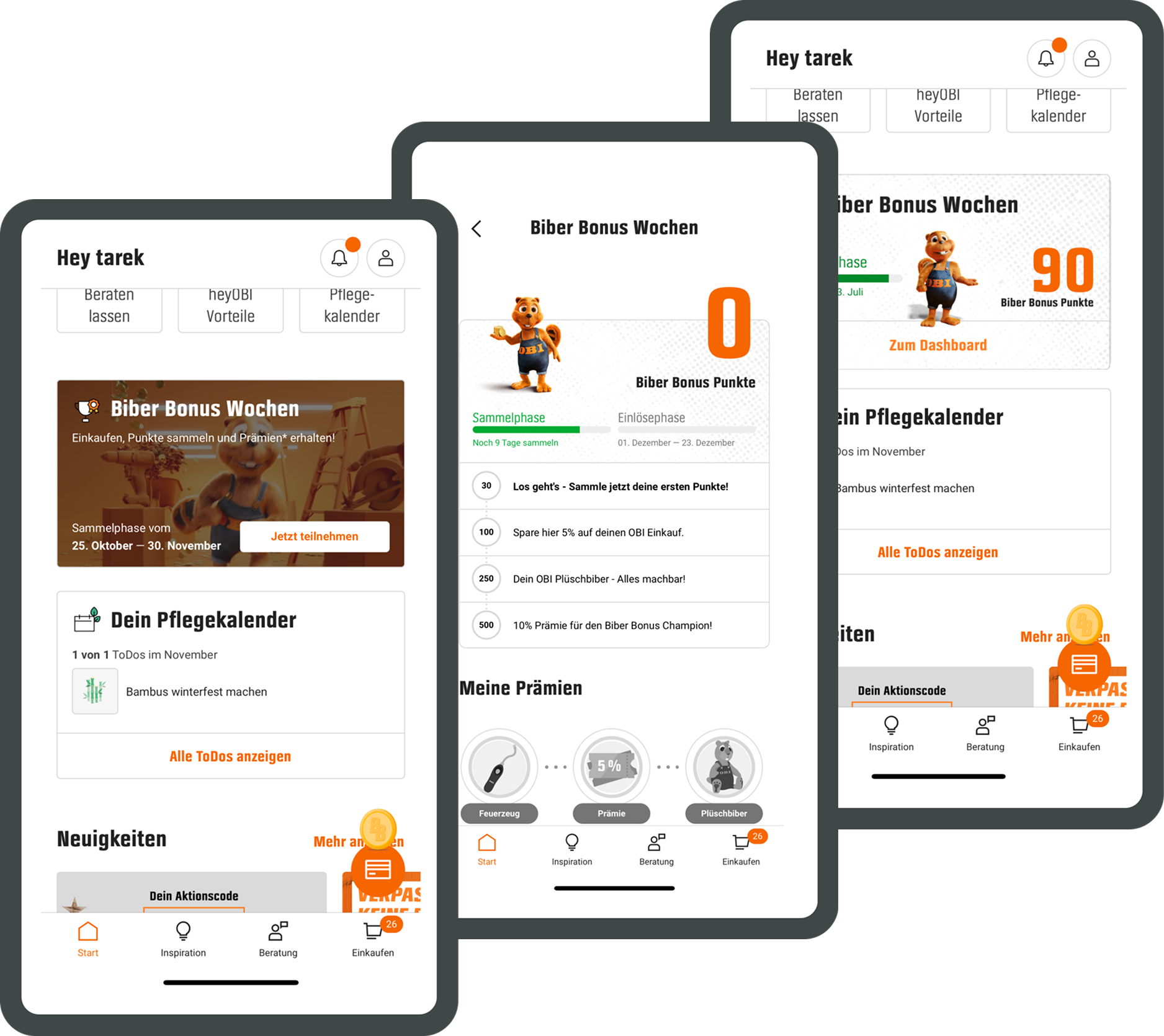
Information architecture: homepage zones
Slide content:
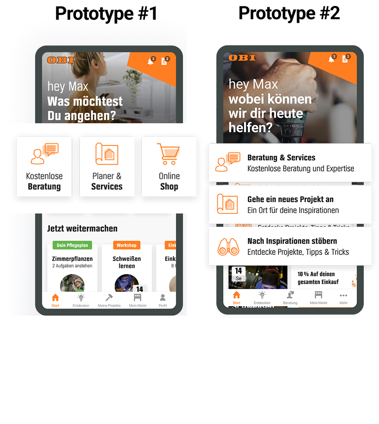
Primary Actions: three core features prioritized at top.
Ongoing Processes: status card zone (3–4 cards).
Explore & Services: secondary features and discovery.
Promotions: marketing space (one protected slot).
his was an IA reframing: predictable zones with clear roles. Users now know where to look for quick actions vs ongoing process status vs discovery. I designed the deep-linking and one-tap paths so a click lands a user directly into the right flow
Take a minute to write an introduction that is short, sweet, and to the point. If you sell something, use this space to describe it in detail and tell us why we should make a purchase. Tap into your creativity. You’ve got this.
Dynamic home widgets identified as highest-impact, lowest-risk solution
Easy to locate and find
also mention that this widget is updated directly on the home screen when ever there is a change , and not the
consistant elments that not compeat but are personlised depnding on AI
if these elments are played then others are not
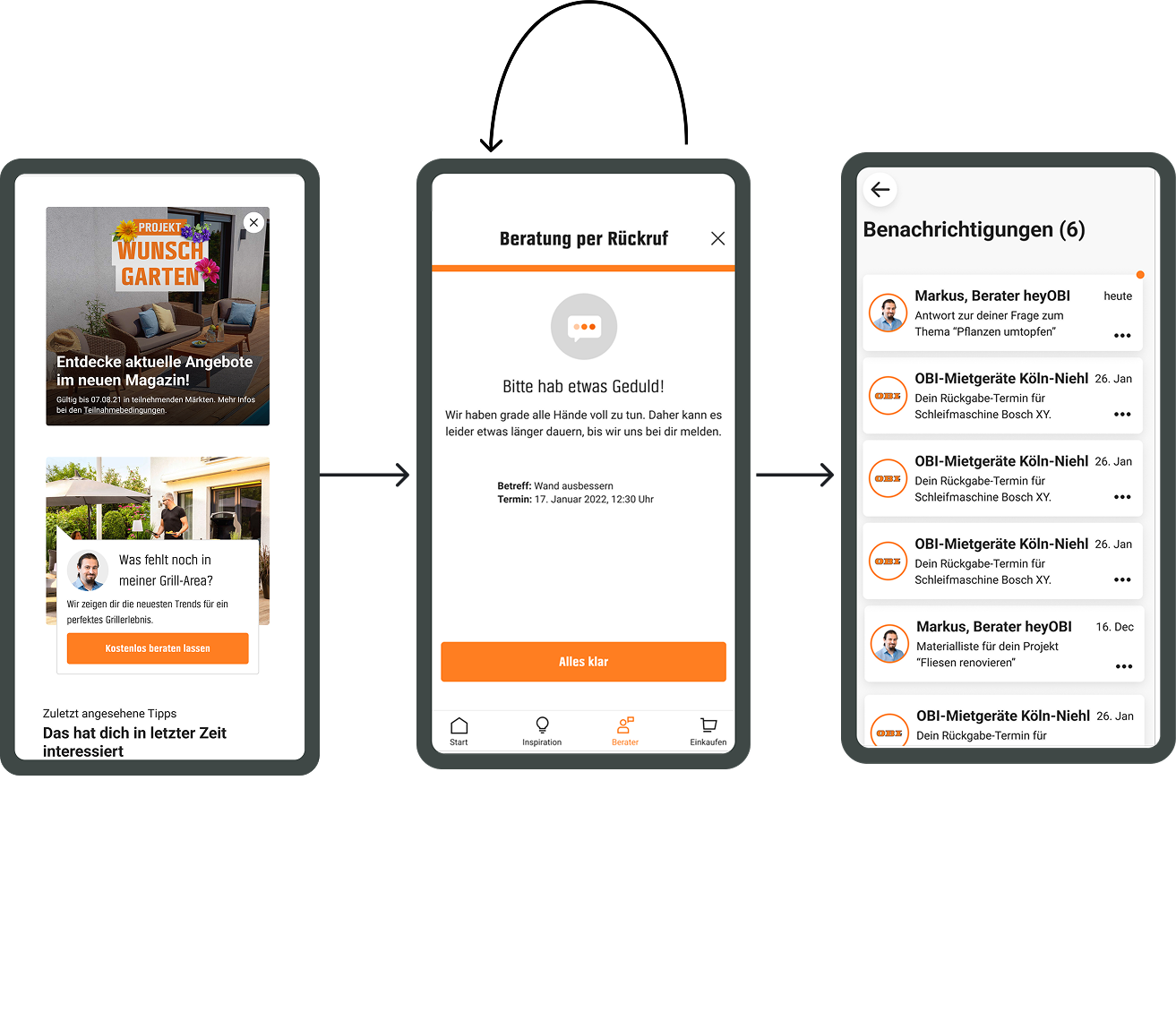
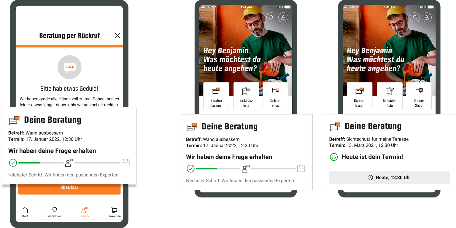
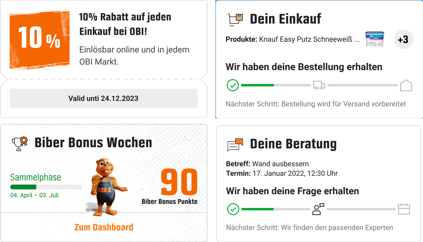
Card structure: title, status badge, short description, primary CTA, timestamp.
Applied to: Appointments, Orders, Campaigns/Points, Expert inquiries.
Behavior: independent refresh, dismiss/personalize, deep link into flow.
Speaker notes:
“I created the spec for the Status Card so any process can show the same visual language. Example: for appointments the badge shows ‘Awaiting confirmation’ → CTA ‘View reply’; for orders it shows ‘Shipped — track’. I specified fallback and error states and the rules for personalization/dismissal.”
Take a minute to write an introduction that is short, sweet, and to the point. If you sell something, use this space to describe it in detail and tell us why we should make a purchase. Tap into your creativity. You’ve got this.
Take a minute to write an introduction that is short, sweet, and to the point. If you sell something, use this space to describe it in detail and tell us why we should make a purchase. Tap into your creativity. You’ve got this.