
Streamlining Support — Reduced Resolution Time by 60%
Client
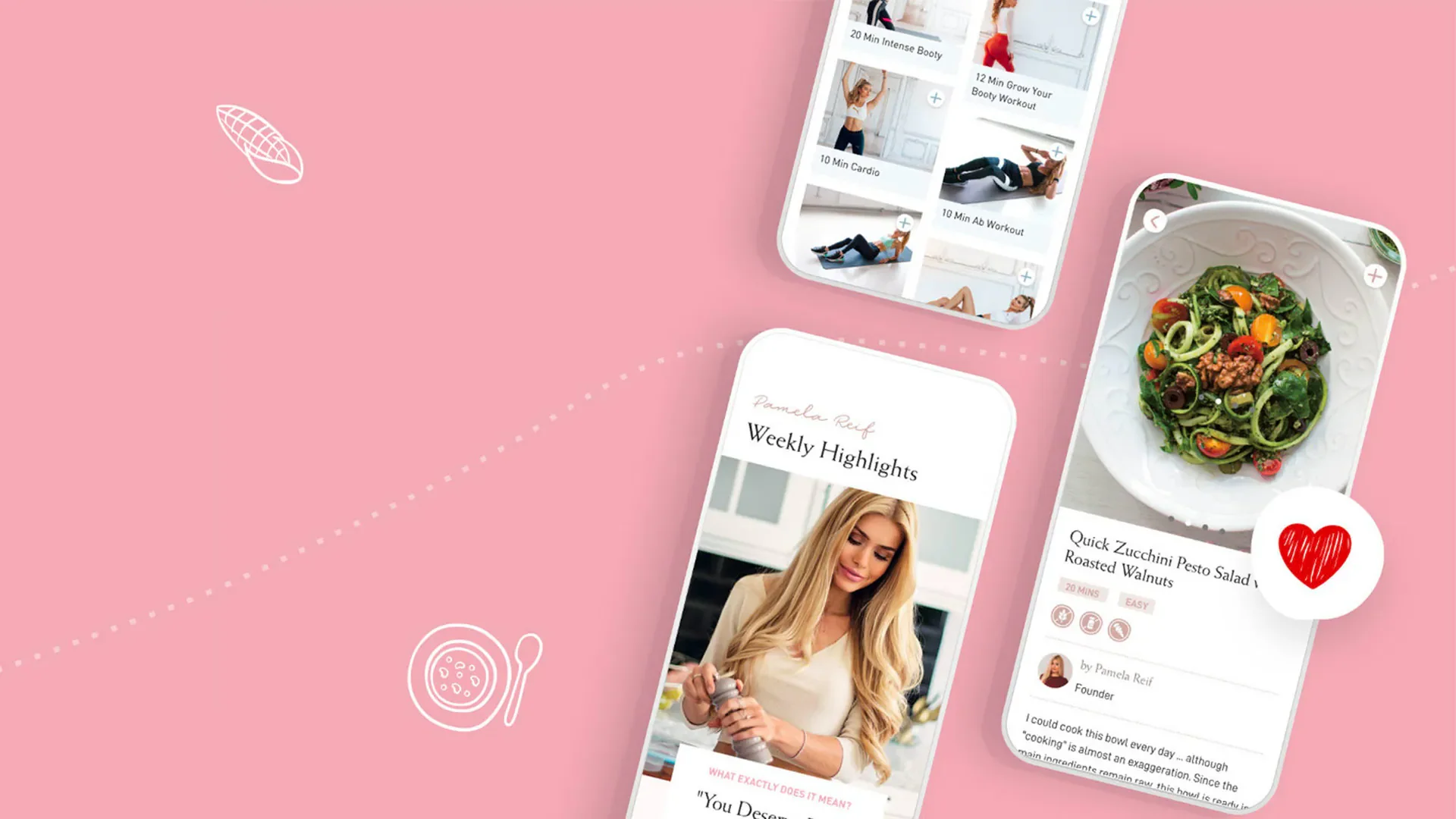
German Fitness Influencer
Pamela Reif is a German fitness, nutrition, and lifestyle influencer with millions of followers across platforms. Her app, the “Pam App,” offers a curated mix of healthy recipes, workout plans, blog content, and smart meal-and-workout planning tools.
Role
Product Manager and Designer (end-to-end)
I led research, co-created solutions with stakeholders, scoped a phased rollout with engineering, and delivered designs and acceptance criteria for development.
The problem
Support lived behind a single email address. Users couldn’t find help, repeated queries flooded ops, and many users abandoned the app after unresolved issues. The company had high manual effort and slow SLAs.
The goal
Make support faster, more accessible, and more scalable while reducing ops load.
Research
I synthesized insights from 400+ app reviews, hundreds of customer emails, ticket logs and stakeholder interviews. Ran empathy mapping and identified the top pain points and ticket categories.

Pain Points:
Support was buried in the app (single email address)
Users struggled to resolve issues quickly ("I couldn’t find help for my login error!")
No self-service options led to repetitive queries
Definition
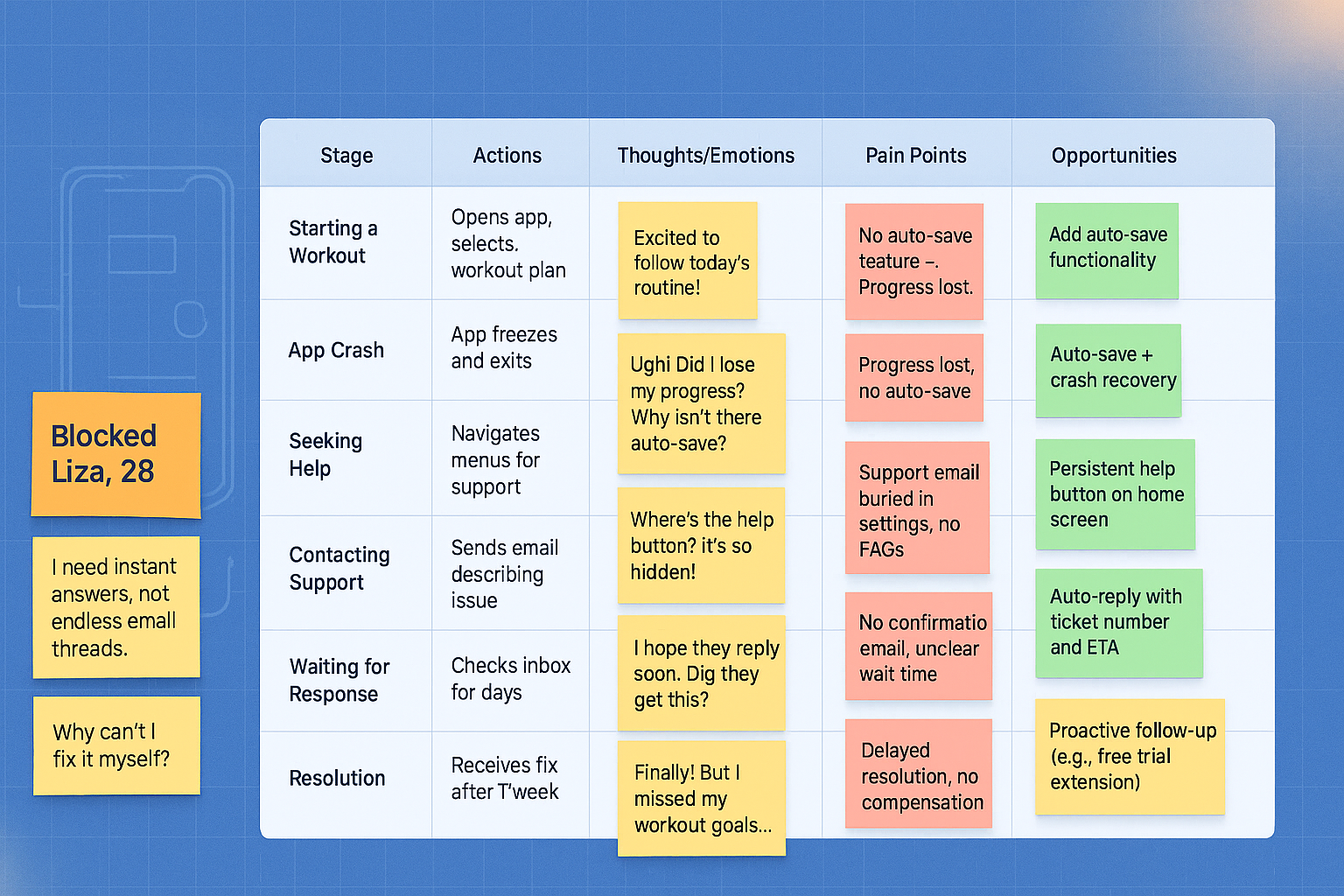
I created personas (e.g., Ghostee Anna, Confused Cara, Blocked Liza) and mapped journeys to highlight frustration peaks and abandonment moments .
Ghostee Anna: “No response after days—I felt ignored!”
Confused Cara: “The support email is impossible to find!”
Clueless Sara: “Why can’t I solve this myself?”
Blocked Liza: “My app crashed, and I lost my progress!”


Liza, 28
“I need instant answers, not endless email threads.”
“Why can’t I fix it myself?”
Identifying inspiration
Analyzed various customer support flows in apps like MyFitnessPal and Headspace to identify best practices.
Created standardized user flow diagrams and extracted adaptable elements such as categorized ticketing and self-service FAQ features.
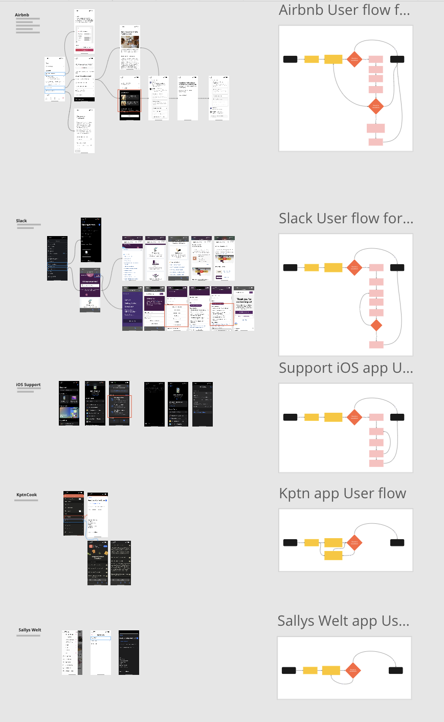
Current User Flow

Ideation & alignment
I led a cross-functional workshop (design, PM, engineering, ops) to generate options and prioritise by impact and feasibility.
“How Might We” Ideation Workshop:
“How might we make it easier for users to get faster feedback?”
After multiple rounds of collaborative ideation and prioritization, we pursued the following concepts:
Categorize Problems: Users select issue types upfront (e.g., login, payment).
Knowledge Base/FAQ: Self-help articles for common issues.
Automatic Feedback: Status updates post-request.

Prototyping & validation
Through multiple rounds of design critiques and usability checks, I refined low-fidelity prototypes into the following validated features:
Smart Forms: Users submit details upfront (screenshots, error codes).
Empowerment: FAQ hub for self fixes.
Transparency: Automated updates and progress tracking.


Service design
I documented the full service blueprint to align frontstage (app flows, emails, FAQ), backstage (support agent actions, routing rules), and systems (ticketing, CMS, analytics). The admin dashboard is framed as a backstage control panel that connects design to ops: it surfaces spikes, root causes, and guides content updates to the FAQ.
Solution (key features)
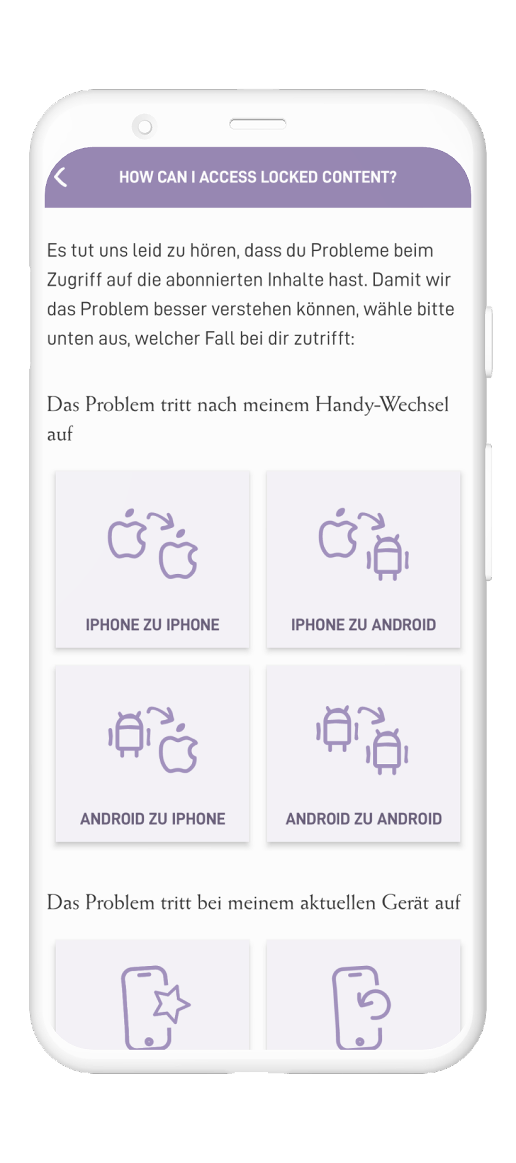
Smart Forms + basic auto-replies: Structured issue categories and required fields (screenshots, error codes) to route and clarify requests.
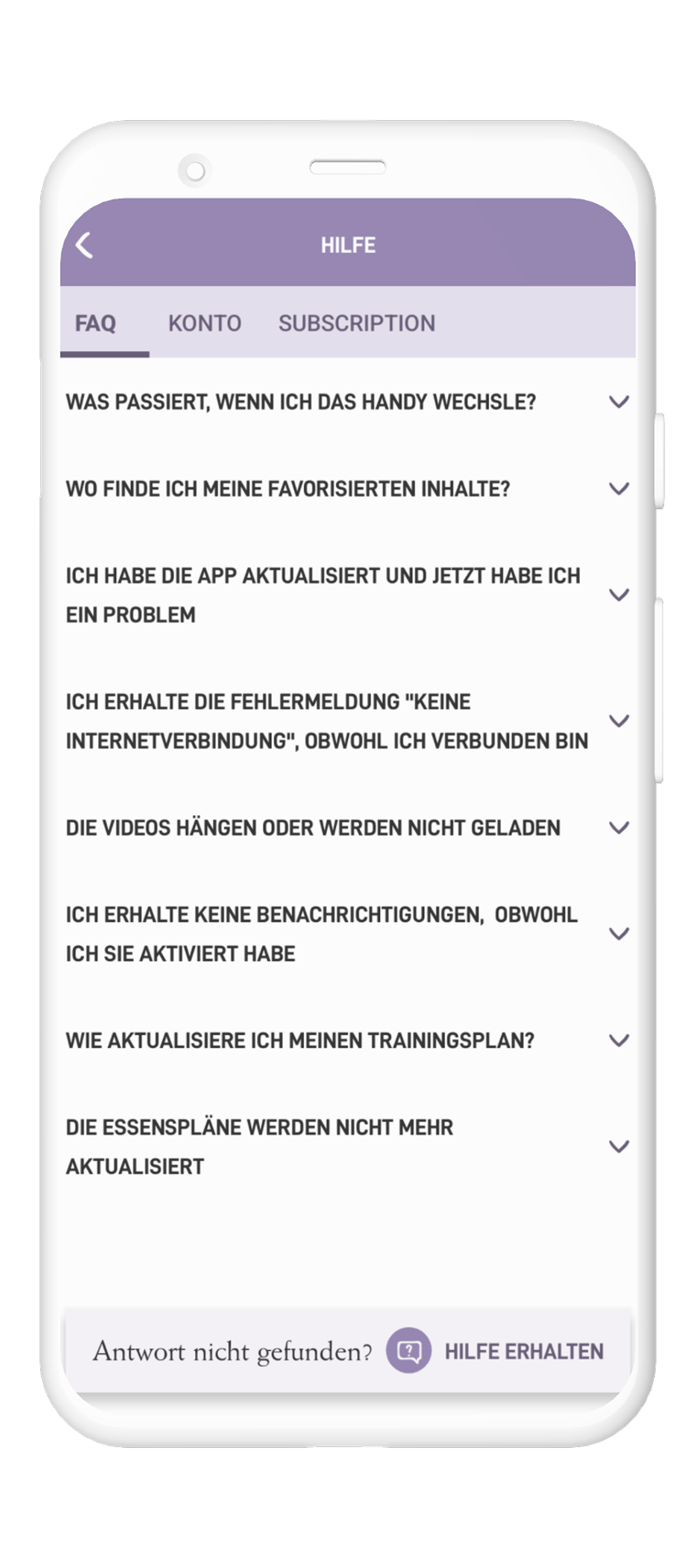
FAQ/Knowledge Hub: Searchable self-service articles that empower users to resolve common problems without contacting support.
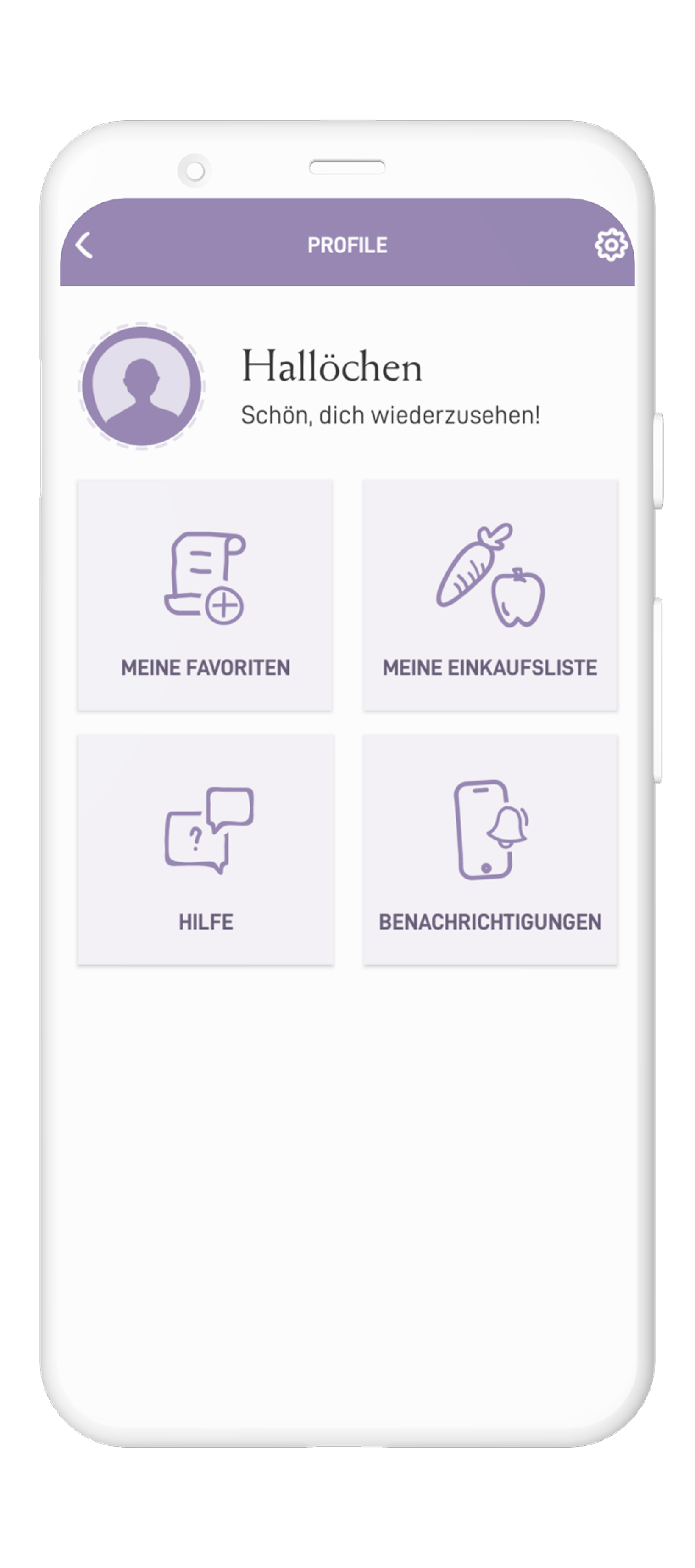
Automated Status Updates: Transparent progress notifications to keep users informed and reduce repeat follow-ups.
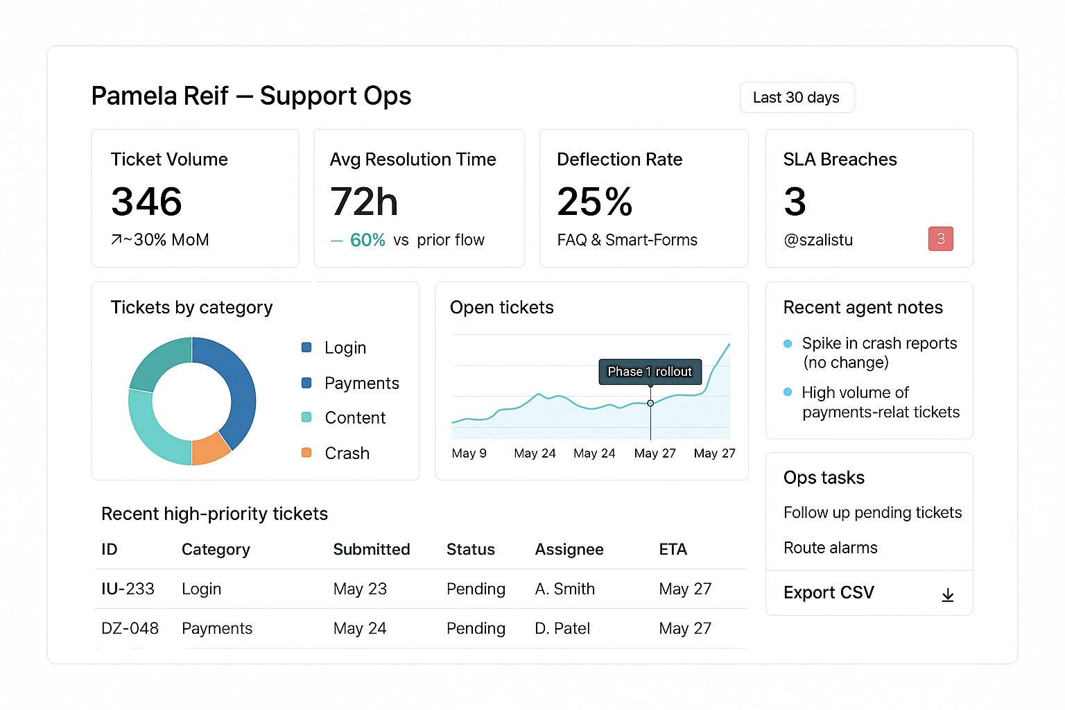
Admin Dashboard (backstage): KPI panel for ops showing ticket volume by category, average resolution time, deflection rate — used to monitor improvements and drive prioritisation.
Delivery & rollout
Cross-Functional Prioritization
Organizing workshops with the developers to prioritize features (e.g., Smart forms > FAQ hub).
Balancing UX ideals with backend constraints (e.g., real-time sync delays).
Technical Scoping
Phased rollout plan:
Phase 1: Smart Forms + basic auto-replies.
Phase 2: FAQ hub
Phase 2: Real-time status tracking.
Results
Efficiency
60%
Categorized requests reduced resolution time by 60%.
User Empowerment
25%
FAQ hub deflected 25% of repetitive queries
Want to See More Work?
Personal UX Concept for Effortless Wedding Venue Discovery
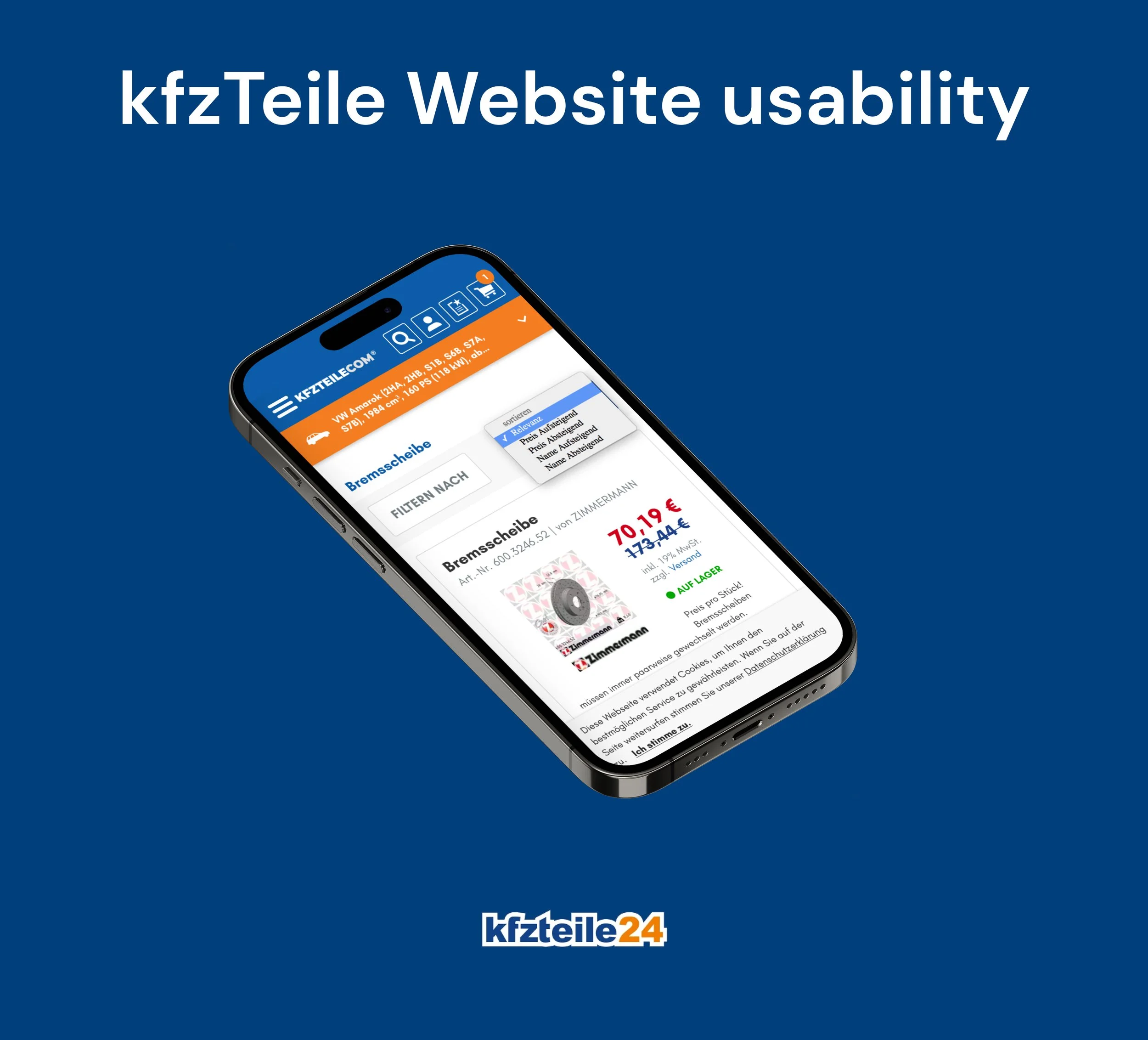
Enhancing Mobile Usability: A User-Centric Case Study
Contact Me
tarek.hassan.it@gmail.com

Location
Cologne, Germany