
Enhancing Mobile Usability: A User-Centric Case Study
Client
German Auto Parts online retailer
Project type
Company Client Project
Role
UX Researcher/ UX Designer
Date
2019
Enhancing Usability: A Comprehensive UX Analysis Approach
Led mixed-method research and design to make the Kfzteile mobile experience usable and conversion-ready. Delivered prioritized design changes, an A/B test program, and an analytics setup; outcomes: clearer vehicle selection flow, denser product lists for mobile, and measurable improvement in engagement.
The problem
The desktop-first site performed poorly on mobile: vehicle selection was hard on small screens, KBA-No visibility was low, and product cards showed too little information — causing friction for both B2C and B2B buyers and harming mobile conversion.
My objective
Prove where mobile UX breaks the conversion funnel, redesign it for mobile, and validate improvements through A/B testing and analytics so product and commercial teams could confidently invest in mobile.
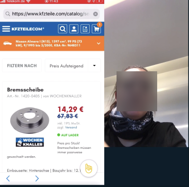
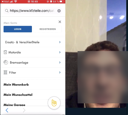
Uncovering Mobile Website Usability: Remote Usability Testing with Diverse UsersWe started by planning and conducting a usability test where we evaluated the website's mobile performance with 7 participants, aged 25-65, including 2 B2C customers and 5 B2B professionals who order few times a year. Utilising Lookback for remote user testing, we captured key observations. Stakeholders participated as silent observers, gaining direct user understanding. In the subsequent workshop (as you will see later), we presented and addressed user behavior and pain points using highlighted recordings from the usability testings.
Insights and Recommendations
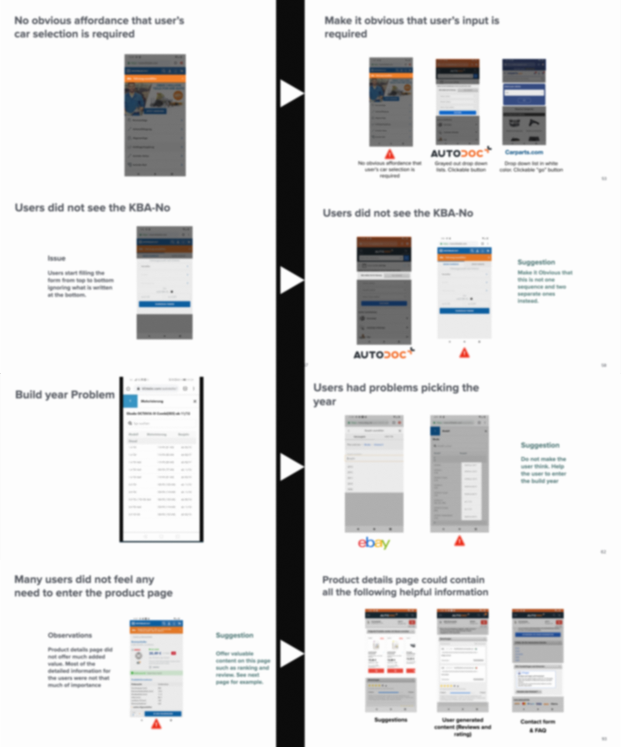
In the usability study, we uncovered important insights regarding the mobile usability of the website. Some issues were related to user's car selection and the visibility of the KBA-No (car registration number) on the small screen sizes.
incorporating valuable input from competitors analysis helped us adopt a comprehensive approach to optimize the mobile interface .We provided our first drafts of the suggested improvements to make these processes more intuitive and user-friendly on mobile devices.
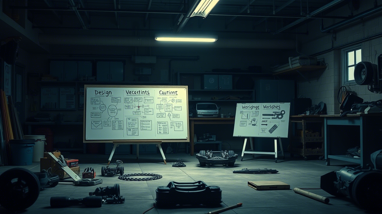
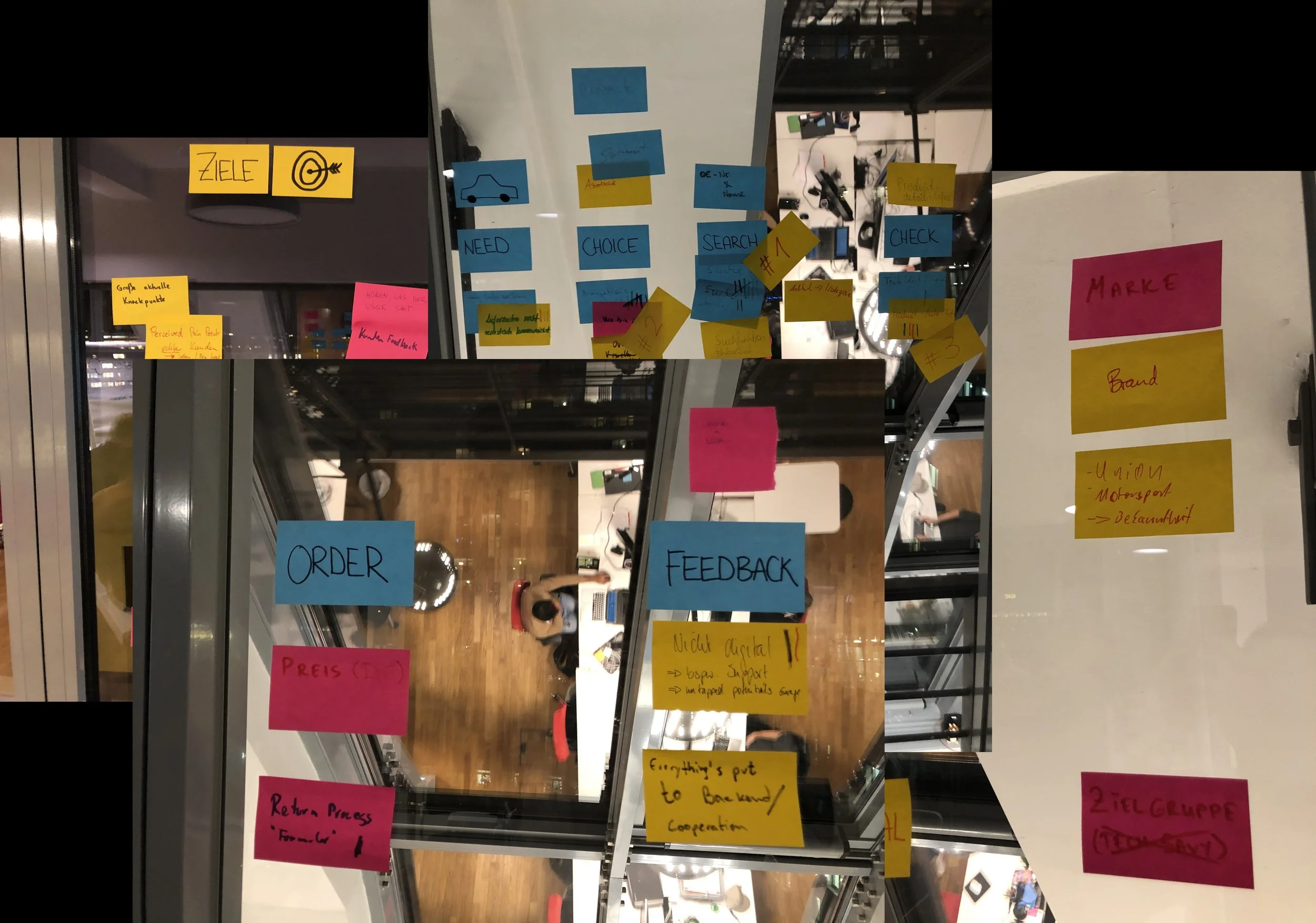
Collaborative Workshop: Enabling a Mobile-First Approach
We organised a workshop with the stakeholders where we started by presenting the test results and analysis, highlighting areas for website improvement to align with a mobile-first approach. We followed that up by engaging brainstorming sessions where we collectively redefined the current strengths and identified the top opportunities for enhancement. At the end of the workshop we had a clear idea of the key user journeys that need to be tackled through mobile-first design principles.
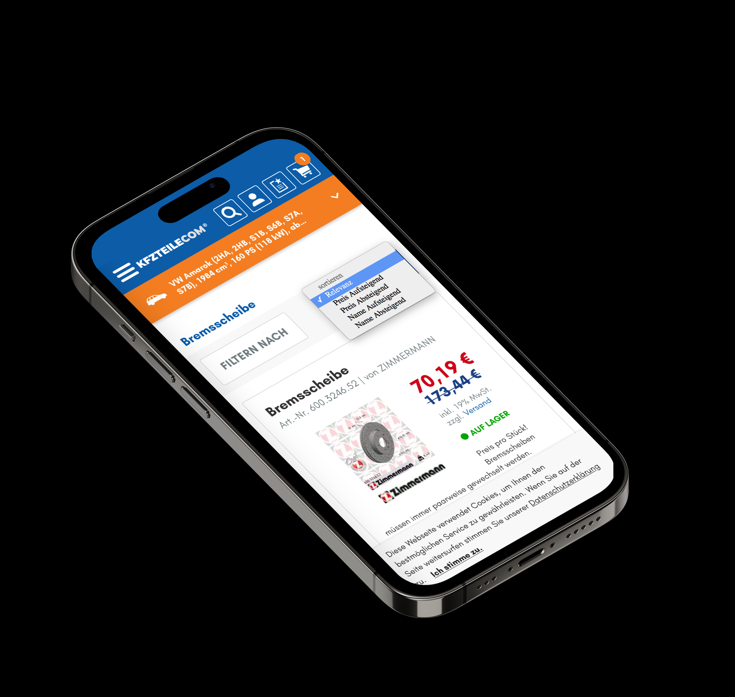
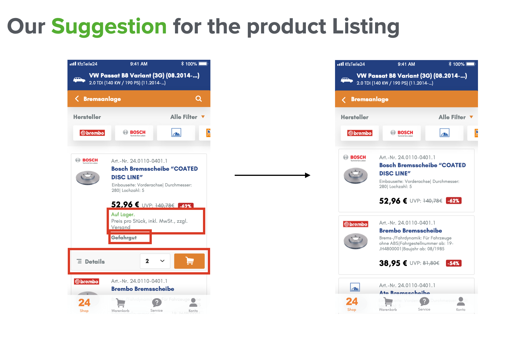
Enhancements for Website and AppWe leveraged these insights to enhance both the website and the app, identifying areas that could benefit from the improvements. For instance, we applied the findings to optimize the app's product listing, displaying essential information on smaller product cards. This approach allowed for more products to be visible at once, maximising the screen space on mobile devices and improving the user experience.

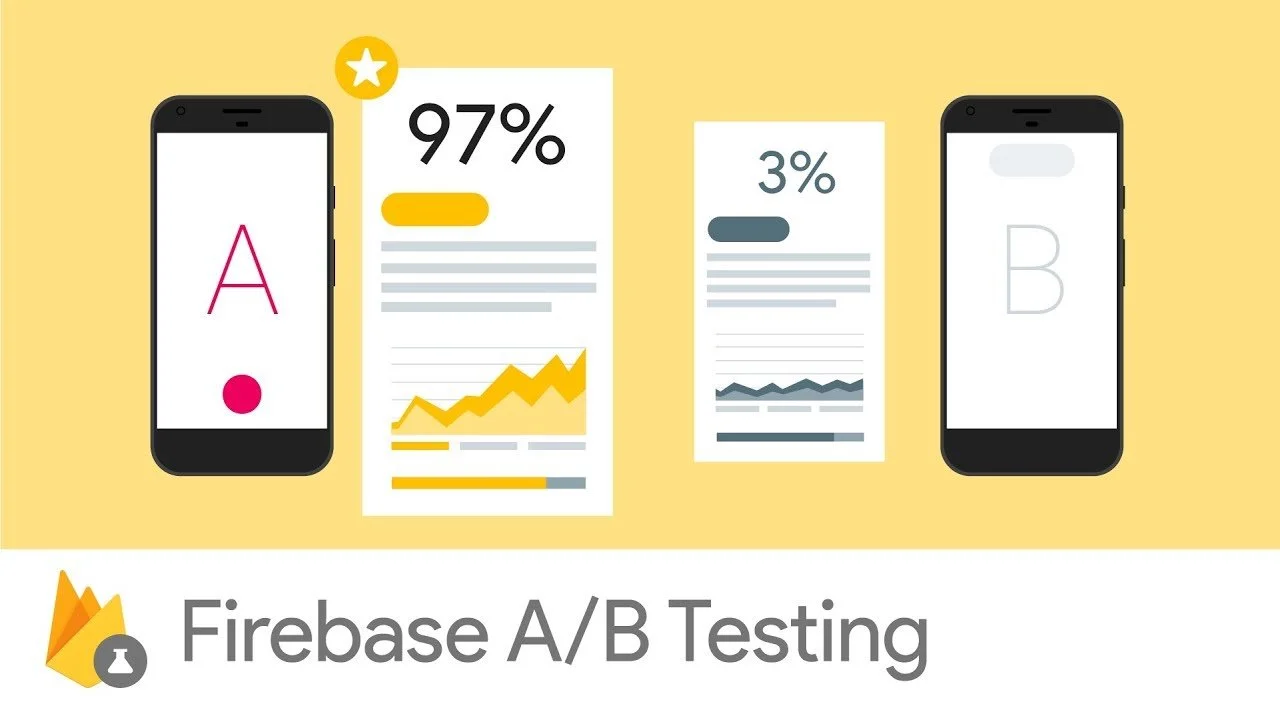
Analytics and AB testing We implemented AB testing concept with different variations of designs to identify the most effective options that resonated best with users, resulting in higher user engagement and satisfaction. Additionally, we established a comprehensive analytics system to track user interactions, behavior, and conversion rates across both the website and app. These analytics helped us in measuring the success of the A/B testing, enabling us to gain valuable insights and make data-driven decisions for further optimisation.

Steps that followed Additional user testing sessions with the enhanced mobile-first designs
creation of a across platforms design system (web and app) for a cohesive user experience
Want to See More Work?

When Innovation Meets Reality: Lessons from the Scan & Go User Research

Streamlining support: A UX-driven overhaul that reduced resolution time by 60%
Contact Me
tarek.hassan.it@gmail.com

Location
Cologne, Germany